As the year rolls halfway into 2024, the major e-commerce design trends are shaping up. Every e-commerce business must remain updated on these trends to remain appealing and competitive.
This article dwells on the top e-commerce design trends set to dominate the online business world in 2024, from minimalism and dark mode to interactive product displays and bold typography. These major trends, when combined, boost the aesthetics and user experience in e-commerce businesses that want to stay ahead.
Minimalist Design
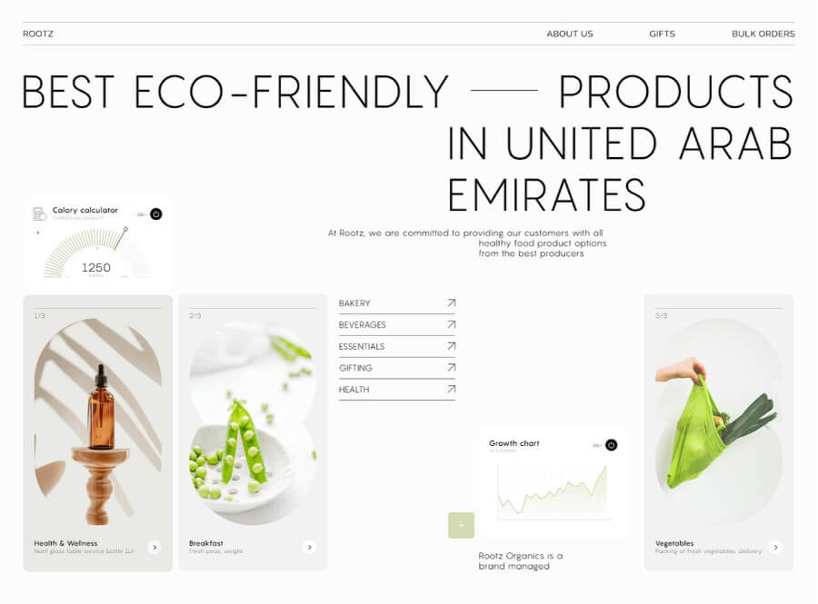
The design has taken a considerable stance characterized by simplicity and clarity. Less design strategy means fewer elements for creating a clean and clear user interface, which helps to improve user experience through reduction of clutter and more straightforward navigation.
Benefits of minimalist design
Reduced loading time. Because a minimalist design involves decreasing the elements and simplifying the graphics in web interfaces, it leads to minimized consumption by web servers and increases page-loading speed.
User focus. The design enables users to concentrate on important content and products without adding unnecessary distractions.
Enhanced visual appeal. This minimalist design suits people with various tastes. Websites look professional and polished when this design with modern and clean aesthetics is used.

Dark Mode
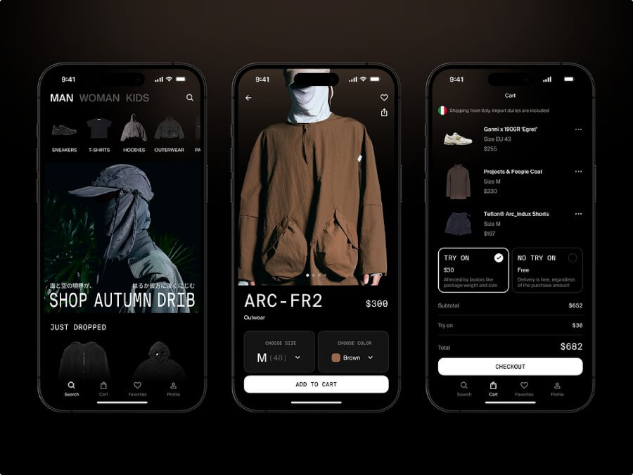
Dark mode is one of the most sought-after features for aesthetic and usability reasons. This mode gives a glossy and modern look while reducing eye strain, especially in low light. Most users now prefer dark mode, making this one of the most necessary features for e-commerce websites.
Advantages of dark mode
Reduced eye strain. It is pretty friendly to the eye, mostly in dim conditions, giving the user a more comfortable experience using the internet.
Battery savings. Dark mode may save battery power for OLEDs and AMOLEDs, so dark interfaces benefit their users better.
Modern appearance. The dark mode generally looks very stylish and fresh, which is appreciated by its many users. They are developing dark-mode elements. Creating a dark mode interface requires more than an inversion of color. Careful thoughts about contrast, readability, and aesthetic consistency must be presented.

Interactive Product Displays
Interactive product displays play a significant role in making the shopping experience dynamic and exciting for customers. This trend includes zooming, 360 views, and clickable features that give the user a complete feel for a product.
Benefits of interactive product displays
Enhanced user engagement. Interactive elements draw the attention of users to encourage exploration, and thus site visitors will stay for longer.
Comprehensive views of products. Features such as 360-degree views coupled with zoom allow customers to get a closer view of a product they are interested in. This, therefore, minimizes their uncertainty in that product.
Lower return rates. The ability to view detailed and interactive images of a product allows customers to make an informed decision, which is likely to reduce returns.
Implementing interactive product displays
Design for a simple user experience.
Seamless integration.
Use high-quality images and make sure that the interactive elements load fast to keep the user experience smooth.
Micro-Animations
These small, subtle animations work on a small scale to help users interact with the system more effectively without overwhelming them. They can inform, notify, or guide users across the interface.
Best Practices for Micro-Animations
Draw attention. Use them to draw attention to essential features and call-to-action buttons.
Make sure they’re smooth. Animations should not be overly done, so they don’t affect the user experience.
Use a light touch. Overusing animations can cause a cluttered interface and slow the website, so apply them judiciously.
Micro-Animations Examples
Hover effects of buttons or links. Change appearance when users hover over a button or link to show interactivity.
Animated loading indicators help keep users informed and entertained during the loading process.
Form feedback. Provide instant form field feedback to guide users in typing data.
3D Visuals and Graphics
3D visuals are gaining traction for their ability to provide a more immersive and detailed view of products. This trend enhances product presentations, making them more engaging and informative.
Benefits of 3D graphics
Comprehensive product views. 3D visuals allow customers to explore products from multiple angles, providing a better understanding of features and details.
Enhanced engagement. Interactive 3D graphics can capture user attention and make the shopping experience more engaging.
Brand differentiation. High-quality 3D visuals can set a brand apart from competitors by offering a more sophisticated and cutting-edge presentation.
Finding the Perfect 3D Visuals
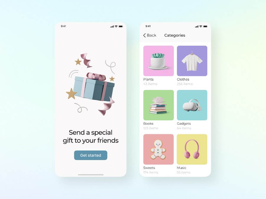
Ouch! illustrations provide various high-quality 3D graphics suitable for various purposes. Designers can find and incorporate interactive product models that users can explore from different angles, offering a richer shopping experience.

Immersive Shopping Experiences
Immersive shopping experiences, which in some cases are brought about by virtual reality (VR) and augmented reality (AR), bring a whole new world to the old function. With these technologies, customers can try items virtually or see how they would look in their environments before purchasing.
Designing Immersive Experiences
Build life-like models. Develop high-quality 3D models of products to realize immersive and believable experiences.
Make them intuitive. Design easy-to-navigate interfaces, even for users unfamiliar with VR or AR.
Show it off. Utilize immersive technology to highlight your product features in a fun and interactive manner
Applications of Immersive Shopping
Virtual try-ons. These enable consumers to visualize how clothing, accessories, or furniture will look in their environment and on them.
Interactive catalogs. Develop virtual catalogs that allow users to navigate through products in an interactive setting, making it easy to engage with products.
Bold Typography
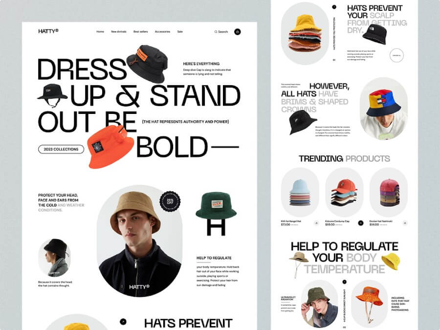
Bold typography will be a headline trend in 2024 by attracting attention and delivering more powerful brand messages. This is the trend in which big, impactful fonts highlight information to make a very strong visual impression.
Choosing and Pairing Fonts
Reflect the brand’s personality. Choose fonts that reflect the personality and message of the brand without lacking overall consistency.
Combine for contrast. Pair heavy fonts with lightweight ones in a blend that ensures there’s a visual hierarchy, pulling the user’s eye in different directions.
Ensure readability. Even though bold fonts are designed to be attention-grabbing, they should still be easy to read and look great, even when viewed at different screen sizes and on other devices.
Designing with Bold Typography
Utilize a big typography layout in your projects to attract user interest in the critical element of the design you want to showcase — the name of a product, special deals, or calls to action. A contrasting color palette with enough white space will help make your content more legible and eye-catching.
Learn the history of fonts to find the perfect one for your design.
Sustainability and Eco-Friendly Design
Both individuals and business organizations are highly focused on sustainability. Green design comprises visuals and materials that connote an organization’s commitment to environmental stewardship.
Incorporating Sustainability into Design
Use green palettes. Use natural color schemes while branding to signal sustainability without saying a word for it.
Highlight eco-friendly practices. Well-promoted brand practices should be blended with sustainable practices and green products directly onto the website.
Optimize resource. Design for efficiency in nature: Reduce waste and use resources best.
Design Elements for Sustainability
Eco-friendly icons. Use icons and graphics representing sustainability, such as leaves, trees, and recycling symbols.
Educational content. Include sections that educate customers about the brand’s sustainability efforts and the environmental benefits of their products.
Mobile-First Design
As most online shopping occurs on mobile devices these days, designing with mobile comes first. Such a trend ensures that e-commerce websites are optimized for mobile users, providing an experience no different from desktop users.
Key Elements of Mobile-First Design
Simplified navigation. Design navigation menus that are easy to use on small screens, with clear categories and intuitive icons.
Fast loading times. Optimize images and reduce unnecessary scripts to make your site load fast, especially for mobile users.
Responsive design. Ensure your website responds appropriately on any size and orientation screed, ensuring a smooth user journey.
Best Practices for Mobile-First Design
Prioritize content. The primary or main content and on-site features should be accessible without the mobile user encountering numerous difficulties.
Touch-friendly elements. Make buttons and other interactive elements big enough to be easily tapped by a finger.
Test across devices. Test your website on multiple mobile devices to ensure compatibility and usability.
Wrapping up
By incorporating these design trends into the future of e-commerce in 2024, one will be better placed to enrich user interaction and, thus, improve their success. Designers can use these new design approaches, integrating inventive attributes like 3D graphics and interactive components, to make engaging and functional websites that capture the attention of online shoppers amidst growing competition. Stay cutting-edge and be ahead of the game by welcoming and embedding these trends into your design strategy. And if you are looking for more design inspiration make sure to check out this list of the best ecommerce website designs.