A clean layout is rarely the result of doing more. It’s usually the result of doing fewer things, more intentionally. And nowhere is that more obvious than where photography meets typography. You can have a gorgeous image and a beautiful typeface, then combine them and somehow end up with a design that feels like two strangers stuck in the same elevator, avoiding eye contact.
The aesthetics of a layout are shaped by how images and type are combined, and this concept is central to effective design, helping to create visually appealing and purposeful communication.
When images and type are paired thoughtfully, a page feels effortless. Visitors can scan quickly, understand what matters, and move toward your call to action without friction. Throughout the history of graphic design, early examples such as the invention of the printing press marked pivotal moments in the evolution of pairing images and type, setting the foundation for modern design practices. When the pairing is sloppy, the page feels noisy, amateur, or simply hard to read, even if no one can articulate why.
This post is a practical guide to pairing stock photography and typography so your layouts look cleaner, read better, and feel more “designed” without adding complexity. We’ll cover the decisions that matter: contrast, hierarchy, spacing, alignment, and the subtle tricks that make stock photos feel like they were made for your brand.
Innovation in design tools and techniques has continually influenced how designers achieve cleaner layouts by combining stock photos and typography.
Why Stock Photos and Typography Clash
The most common issues are predictable:
The image is too busy behind the text
The font style doesn’t match the image’s mood
The layout lacks hierarchy, so everything competes
Spacing is inconsistent, making the design feel jittery
Text is placed randomly on top of the image without a system
The image crop doesn’t leave room for words
Colors fight, so nothing feels calm or cohesive
The fix is not “pick better images” or “use a different font” in isolation. The fix is pairing. Images and type must be chosen and arranged as a team. To achieve a cohesive design, it’s important to maintain consistency in how stock photos and typography are paired, supporting the company’s overall branding goals.
Understanding the Role of Graphic Designers in Image-Type Pairing
Graphic designers are at the heart of successful image and typography pairings. Their expertise goes beyond simply choosing a nice photo or an attractive font—they are responsible for shaping the visual identity of a brand or project through thoughtful selection and arrangement of design elements. By understanding how different typefaces interact with images, designers can create layouts that not only look good but also communicate the intended message with clarity and emotion.
For example, when a designer pairs a sans serif typeface with a crisp, modern image, the result is often a sleek, contemporary aesthetic that feels fresh and approachable. On the other hand, combining a serif typeface with a nostalgic or vintage photo can evoke a sense of tradition and elegance. These choices are never random; they are guided by the designer’s understanding of how typography and imagery work together to influence perception and emotion.
Graphic designers also consider how each element—whether it’s a headline, a supporting image, or a call-to-action—contributes to the overall communication goals of the design. Their role is to ensure that every pairing enhances readability, supports the brand’s visual identity, and creates a cohesive, engaging experience for the viewer. By leveraging their knowledge of design elements and typographic principles, designers transform stock photos and type into powerful tools for storytelling and brand expression.
Step 1: Decide Who Leads, the Image or the Type
Every section needs a clear leader. If both image and type try to dominate, you get visual shouting.
Ask: what is this section’s primary job?
If the goal is clarity and scanning, let type lead and the image support.
If the goal is emotion and atmosphere, let the image lead and keep type minimal.
If the goal is selling a specific product or feature, let the type lead but use the image to reduce uncertainty.
The concept behind a section will determine which element leads, and designers can choose from a range of approaches—such as different illustration styles or typographic techniques—to best communicate their message.
A simple rule: the more important the information, the less the image should compete.
Step 2: Match Typography “Personality” to Image Mood
Typefaces have vibes. Images have vibes. If the vibes disagree, the layout feels off even when everything is technically aligned.
Here are a few pairing guidelines:
Clean studio/product photos pair well with modern sans-serifs, geometric fonts, and minimal typography.
Warm lifestyle photography pairs well with humanist sans-serifs, softer serifs, and friendly rounded fonts.
Premium editorial imagery pairs well with elegant serifs, high-contrast type, and refined spacing.
Playful, colorful images pair well with bold sans-serifs, quirky display fonts (sparingly), and punchy hierarchy. Contrasting fonts can complement each other in these layouts, creating a balanced and engaging visual experience.
Techy, cool-toned visuals pair well with crisp sans-serifs, mono accents, and structured typography.
You don’t need a complicated brand typographic system, but you do need coherence. If your images feel organic and handmade, a sharp futuristic font can create dissonance. If your images are sleek and minimal, a rustic serif can feel out of place. The individual characters within a typeface also play a key role in setting the mood and influencing readability, making careful character selection essential for effective communication.
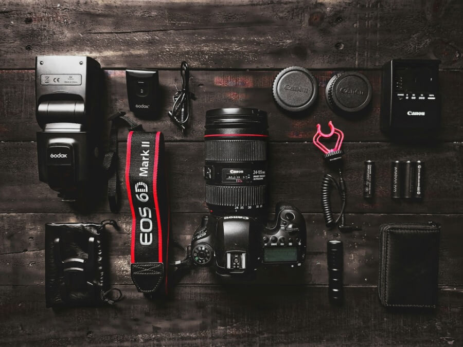
Step 3: Choose Images With Typography in Mind (Not After)
A common workflow mistake is selecting images first, then struggling to find a place to put text. Instead, choose images that naturally support text placement.
Look for:
Negative space (sky, blank wall, blurred background)
Simple areas without high contrast
Subjects positioned off-center (rule of thirds) leaving room for copy
Calm backgrounds if the text overlay is required
Composition that won’t crop awkwardly on mobile
When selecting stock photos for web design, think like a layout designer: “Where does the headline live?” If you can’t answer that quickly, the image may be a poor fit for that section. Also, consider the materials and platforms where your design will appear—ensure that your chosen images and typography work cohesively across all branding materials and digital platforms to maintain a consistent visual identity.
Step 4: Make Text Legible Without Making It Ugly
Legibility is non-negotiable. But it doesn’t have to mean plastering a black box behind your headline. Principles of typographic design guide the choice of techniques for enhancing legibility without sacrificing aesthetics, ensuring that text remains readable and visually appealing in both print and digital media.
Clean solutions include:
Subtle gradients
A dark-to-transparent gradient behind text preserves the image while improving contrast. It feels modern, especially for hero sections.
Soft overlays
A low-opacity color overlay (often using a brand color) can unify the image and make type readable. Keep it consistent across the site.
Blur behind text (used sparingly)
A subtle localized blur behind the text can help, but don’t overdo it or it looks gimmicky.
Shadow and stroke (with restraint)
A tiny shadow can improve readability, but heavy drop shadows tend to look dated fast. Strokes can work for bold headlines but can also feel harsh.
The goal is “readable and elegant.” If your solution draws attention to itself, it’s probably too strong.
Step 5: Use a Repeatable Text Placement System
Random text placement is the fastest way to make a layout feel messy. Choose a system and repeat it.
Common systems:
Text always left, image always right (or vice versa)
Text overlays always bottom-left with consistent padding
Headlines always align to the same grid columns
Captions always appear under images with the same style
Buttons always sit under the subhead, never floating around
Using templates and having all the tools available in design software can help designers implement consistent text placement across projects.
Consistency creates calm. Calm reads as professional.
Pro tip: define a standard padding value for text overlays (for example, “headline sits 48px from the left edge and 48px from the bottom”). Apply across your components.
Step 6: Build Hierarchy With Type, Not With More Visual Noise
Clean layouts usually have strong hierarchy. That means the viewer instantly knows:
what this section is about
what matters most
what to do next
Guiding the reader through effective hierarchy is essential for clarity and engagement. Illustration and symbols can be used strategically to draw attention to key information, support the message, and enhance the overall visual flow.
To create hierarchy:
Use fewer font sizes, but more intentional ones (e.g., headline, body, small label)
Increase line height slightly for readability
Use weight changes sparingly but clearly (regular vs semibold)
Limit text width so lines don’t get too long
Use whitespace as a design element, not leftover space
A busy image plus complicated typography equals chaos. If the photo has visual energy, keep type simpler and bolder. If the photo is minimal, you can afford a more delicate typographic treatment.
Step 7: Control Alignment Like It’s a Mood
Alignment is one of those invisible design forces that people notice only when it’s wrong. Clean layouts usually commit to a grid and stick with it.
Check:
Are your headlines aligned to consistent columns?
Do image edges line up with text edges?
Do captions and buttons snap to the same left edge?
Do you keep consistent spacing between elements?
Even small alignment inconsistencies create a “wobbly” feeling. Tight alignment creates order.
Step 8: Use Captions and Labels to Make Stock Photos Feel Intentional
Stock imagery feels generic when it lacks context. A caption is like giving a photo a role to play, instead of letting it loiter awkwardly. Captions and labels can transform stock photos into effective advertisements for a company by clearly communicating branding messages and campaign themes; thoughtful writing further enhances the storytelling aspect, making the design more engaging and purposeful.
Good caption styles:
Short, specific, and relevant
Matches brand voice (friendly, premium, playful, etc.)
Consistent placement and typography across the site
You can also use labels:
“Case Study”
“New Feature”
“For Teams”
“Behind the Scenes”
When you add structured text around images, the photos feel curated, not randomly selected.
Step 9: Limit Color Conflict Between Image and Type
Sometimes the type is technically readable but still feels messy because the colors clash. This happens when the image has strong hues that fight with your brand palette.
Solutions:
Choose images that already harmonize with your brand colors
Use a consistent overlay to tame overly vibrant backgrounds
Convert certain supporting images to monochrome or duotone (selectively)
Avoid placing brightly colored text on already colorful areas
Your best friend here is restraint. Let the image have color, and let the type be neutral, or vice versa. Too many saturated elements create visual static.
Step 10: Design for Mobile First (Because Mobile Will Expose Your Secrets)
A layout can look clean on desktop and fall apart on mobile because:
the image crops weirdly
the text overlaps the wrong part of the photo
line breaks become awkward
buttons get lost
Practical guidelines:
Avoid tiny text overlays on busy imagery for mobile
Use images with extra breathing room for responsive cropping
Consider stacking: put text above or below the image on small screens
Keep headlines short enough that they don’t wrap into chaos
A clean mobile layout often requires simplifying the relationship between image and type, not forcing the desktop design to shrink.
A Few Reliable Pairing Patterns
If you want plug-and-play patterns that tend to look clean, start here:
These pairing patterns are especially effective in digital design, where layouts must adapt seamlessly across various screen sizes and computer platforms. They also support the consistent use of logos in branding, ensuring visual identity remains strong and recognizable in digital environments.
Pattern 1: Split layout, text-first
Left: headline, subhead, CTA
Right: image with simple background
Works for: SaaS, services, landing pages
Pattern 2: Hero image with gradient overlay
Background: image with negative space
Foreground: headline + CTA in consistent position
Works for: ecommerce, lifestyle brands, campaigns
Pattern 3: Image card with caption
Image on top, short title and text below
Works for: blogs, feature grids, category pages
Pattern 4: Full-bleed image with typographic block
Image spans width, but text sits in a solid color block that overlaps
Works for: premium brands, editorial layouts
These patterns stay clean because they control hierarchy and avoid random overlay decisions.
Common Mistakes to Avoid When Pairing Stock Photos and Typography
Even experienced designers can fall into common traps when combining stock photos with typography. One of the most frequent mistakes is overlooking legibility—if viewers struggle to read the words, the message is lost. Readability refers to how easily text can be read, and it’s influenced by factors like type size, style, and the contrast between text and background. For instance, placing light-colored text over a busy or high-contrast image can make words disappear, while using a font with thin strokes at small sizes can reduce clarity.
Another pitfall is neglecting white space. White space, or negative space, isn’t just empty—it’s a vital design element that helps create a sense of order and hierarchy. Without enough space between text and images, layouts can feel cramped and overwhelming, making it hard for users to focus on what matters most.
Designers should also pay attention to the x height of their chosen typeface—the height of lowercase letters. A font with a low x height can make lines of text appear uneven and harder to read, especially at smaller sizes. Ensuring consistent line spacing and choosing typefaces with good x height can greatly improve readability and the overall flow of the design.
By being mindful of these common mistakes—prioritizing legibility, using white space effectively, and considering the x height of fonts—graphic designers can create layouts that are not only visually attractive but also clear, organized, and easy to navigate. This attention to detail helps ensure that every element works together to support the design’s communication goals.
Bringing It All Together
Pairing stock photography and typography for cleaner layouts isn’t about fancy tricks. It’s about systems: choosing images with space for type, matching font personality to image mood, creating consistent placement rules, enforcing hierarchy, and respecting alignment and spacing.
If you want a simple checklist, here it is:
Decide who leads, image or type
Match typography vibe to photography vibe
Pick images with negative space and crop flexibility
Use subtle overlays or gradients for legibility
Standardize text placement and padding
Strengthen hierarchy with type, not clutter
Align everything to a grid
Add captions/labels to make images feel intentional
Check mobile early and often
Do that, and your stock photos stop feeling like borrowed decorations. They start feeling like integrated brand assets, living comfortably alongside your typography, like two teammates who finally learned each other’s rhythm.